Key Visual Combination
Info
A curated collection of unreleased, high-concept Key Visuals developed during competitive strategic pitches for major commercial campaigns. Covering a diverse industrial landscape—from smart home appliances (AQUA Color AI) and digital banking (ACB Flex Card) to dynamic FMCG (Wake Up 247, Chin-su 365)—this archive serves as a testament to deep brief decoding, showing an agile capability to build bold, comprehensive visual systems that push the boundaries of corporate brand identities.
Year
2025
Client
CHINSU / MASAN
Services
ART DIRECTION / KEY VISUAL / AO / DECK DESIGN
Tools used
ADOBE PHOTOSHOP, ADOBE ILLUSTRATOR, BLENDER, AFTER EFFECT
ADOBE PHOTOSHOP, ADOBE ILLUSTRATOR, BLENDER, AFTER EFFECT

WAKE-UP 247
client
WAKE-UP 247
SERVICES
KEY VISUAL 3D GRAPHIC DESIGN
CONCEPT
"DŨNG MÃNH VƯỢT LÊN GIỚI HẠN" (Roaring Bravery - Beyond All Limits)
The creative concept seamlessly fuses Wake-up 247’s raw, non-stop energy with Manchester City’s fierce, unstoppable football spirit.
The campaign positions the beverage as the ultimate catalyst that awakens the untamed bravery within players and consumers alike, empowering them to shatter every physical and mental boundary.

KEY VISUAL OPTION 1
ART DIRECTION
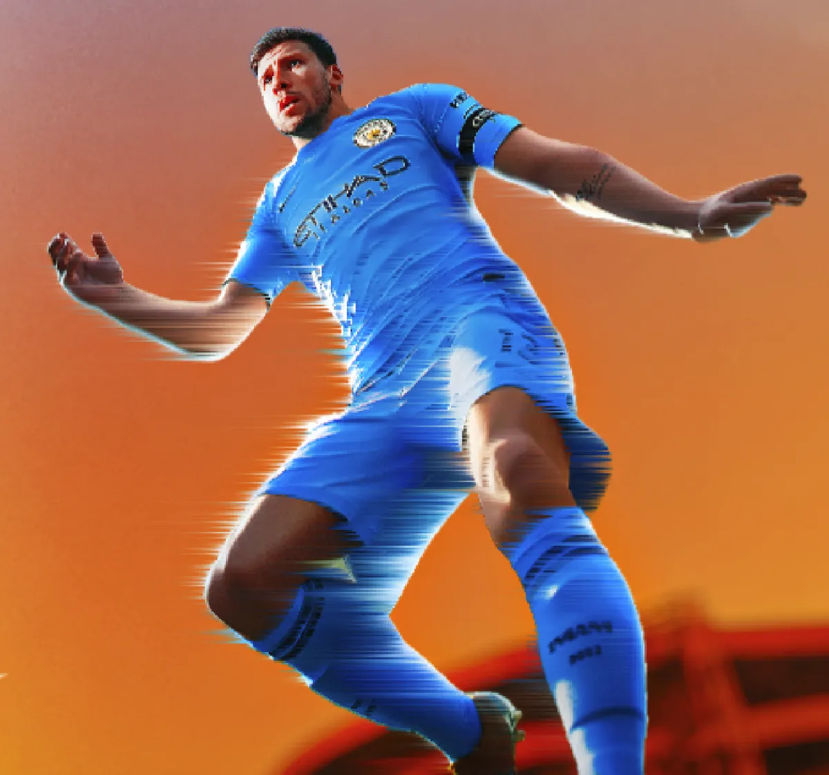
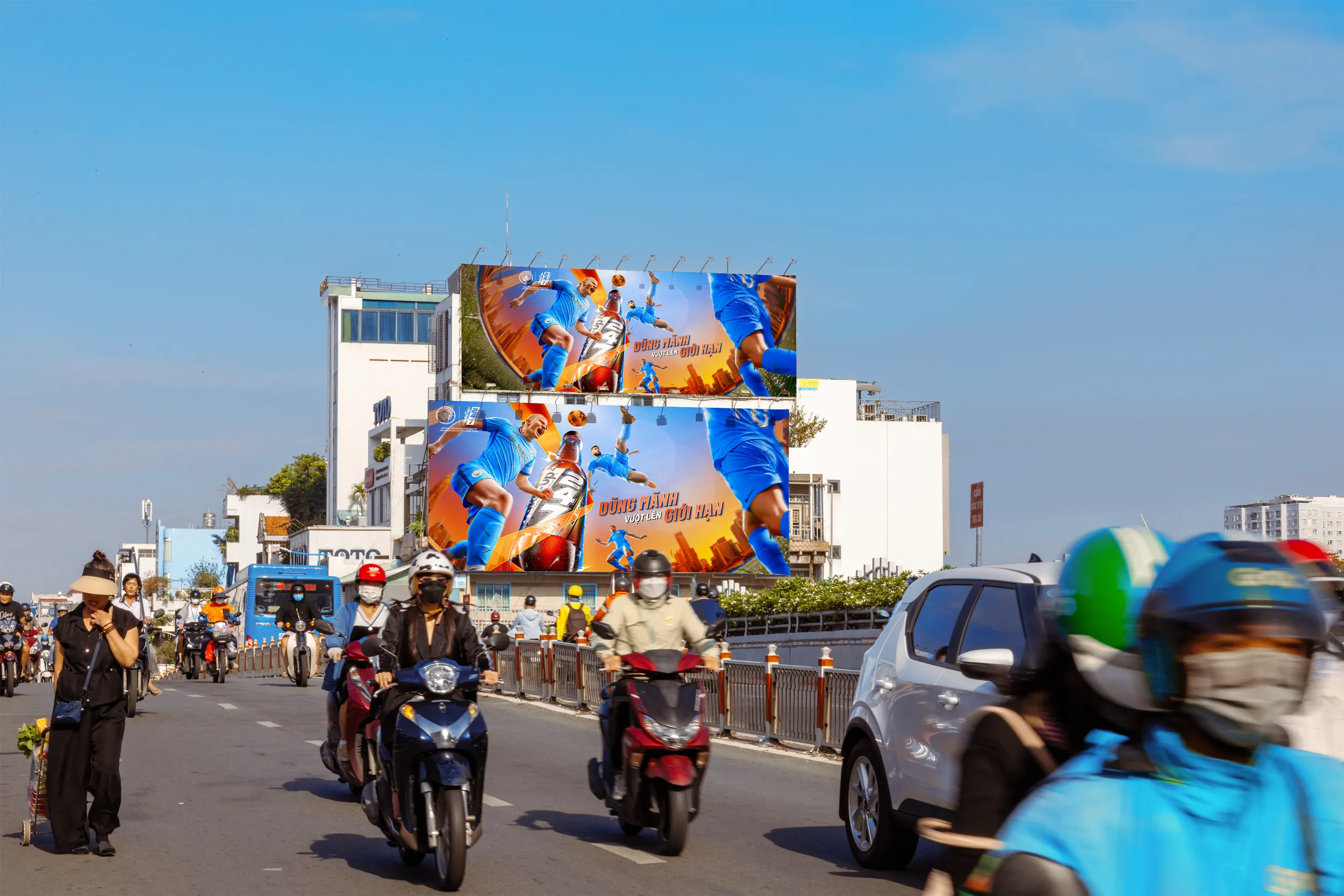
The Key Visual utilizes a highly dynamic composition, anchoring the iconic Wake-up 247 bottle at the center, flanked by Man City stars in explosive, high-intensity action poses to create immersive 3D depth. The color palette features a striking contrast between Man City’s signature Sky Blue and Wake-up 247’s fiery orange-gold. Sharp, aggressive light-streaks slice through the scene, paired with realistic water splashes and motion blur against a dramatic stadium or urban backdrop. The typography features a bold, heavy, tilted sans-serif font to aggressively drive home the main tagline: "DŨNG MÃNH VƯỢT LÊN GIỚI HẠN" (Roaring Bravery - Beyond All Limits).

(04)

(05)

(03)
(02)

(01)
KEY VISUAL OPTION 2
ART DIRECTION
Driven by the tagline "CHUNG DŨNG MÃNH - TUNG MÃNH LỰC" (United Bravery - Unleashing Pure Power), the concept fuses Manchester City’s collective power with Wake-up 247’s explosive energy. The Art Direction utilizes a dynamic, asymmetric layout, featuring a colossal hand gripping the bottle in the left foreground while the squad bursts into a high-velocity horizontal sprint. A solid, fiery orange backdrop forces the signature Sky Blue kits to pop aggressively. Sharp horizontal neon light-trails amplify the supersonic speed, while bold white sans-serif typography cleanly anchors the main tagline in the upper-right space.


CHINSU 365
client
CHINSU
SERVICES
KEY VISUAL 3D GRAPHIC DESIGN
CONCEPT
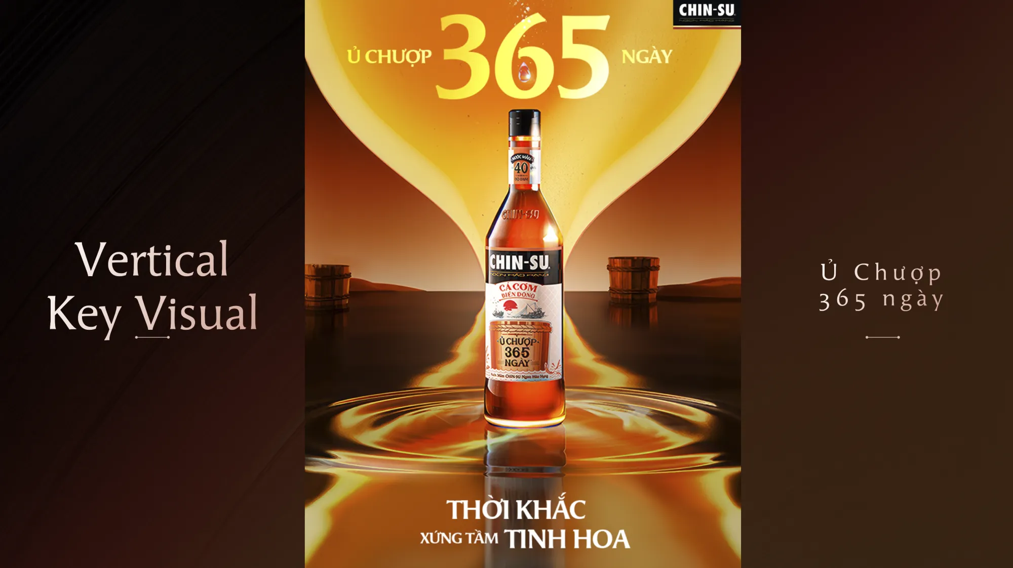
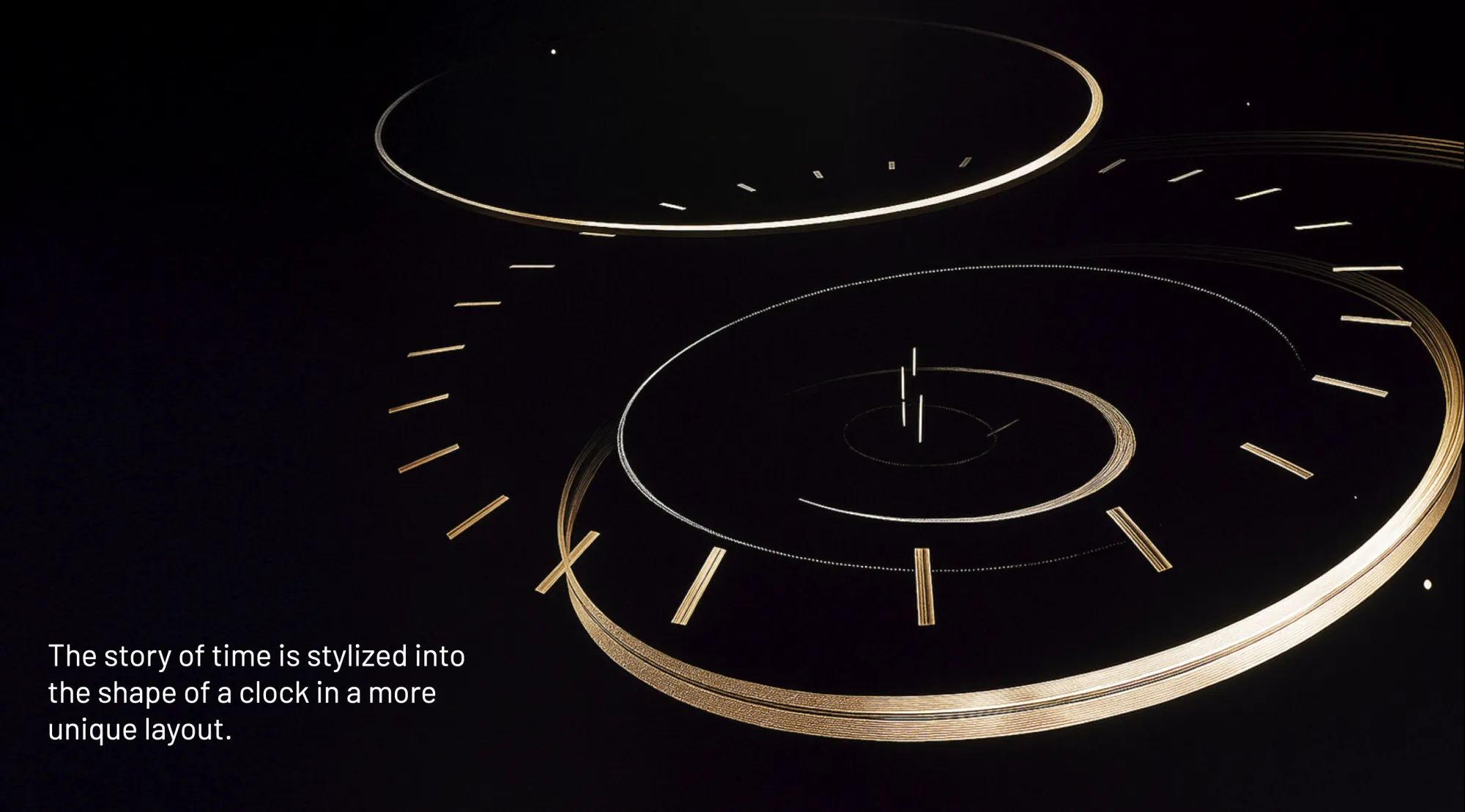
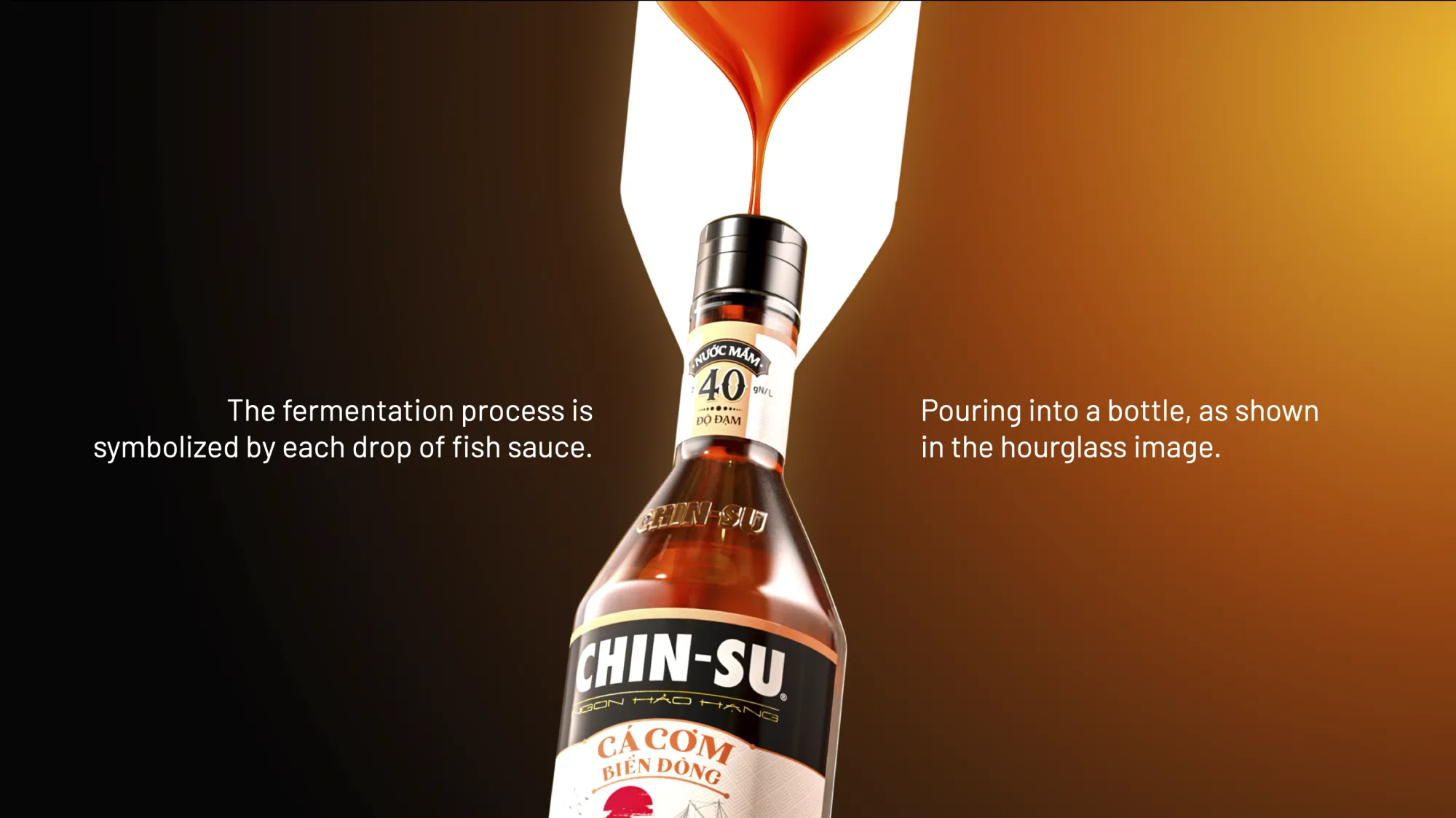
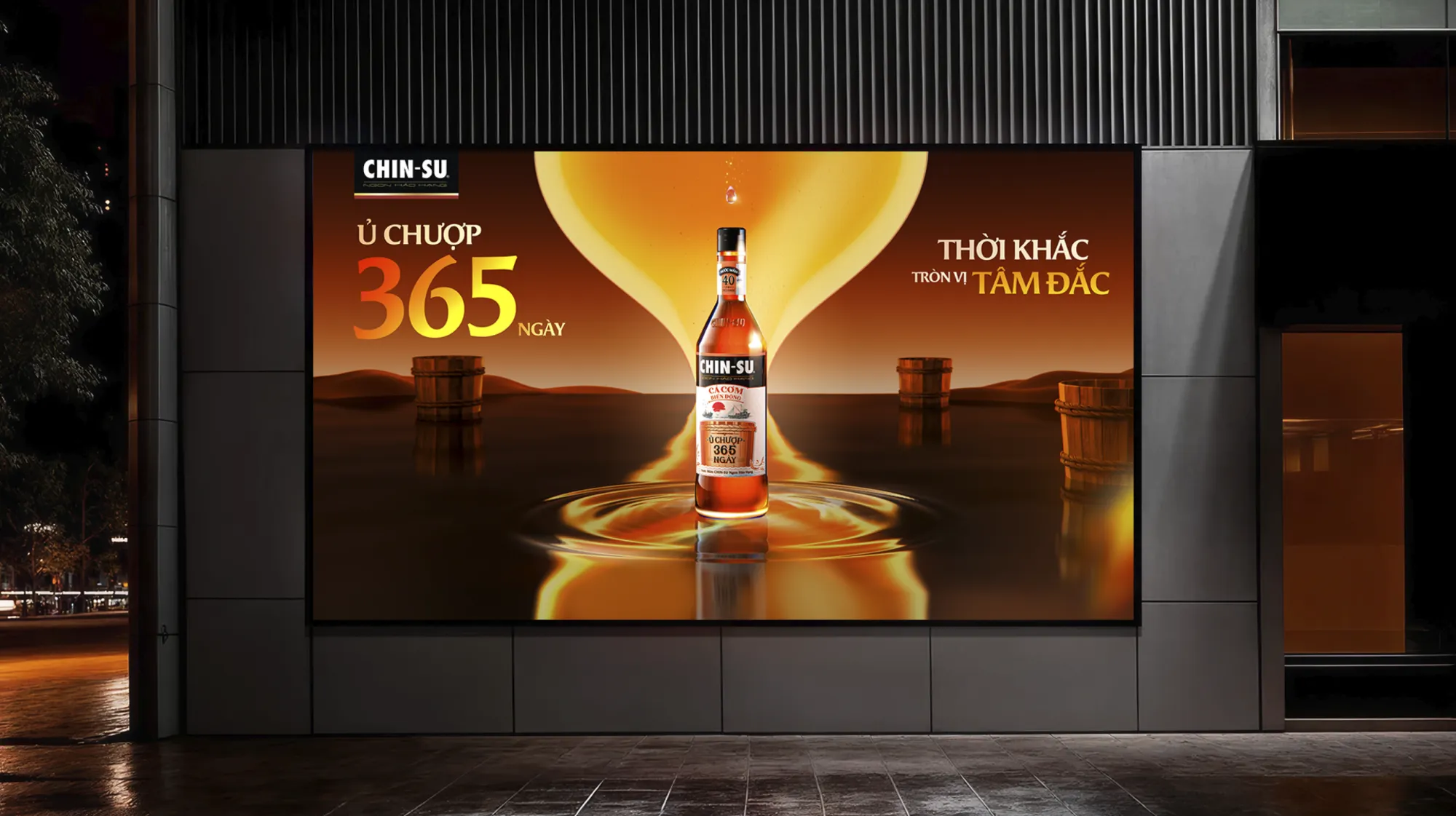
A launching campaign for Chin-su’s premium line that highlights its ultimate USP: a continuous 365-day traditional aging process. The hourglass is strategically deployed as the core visual metaphor, masterfully turning the slow, uninterrupted passage of time into a continuous flow of rich flavor, symbolizing pure dedication and premium quality.
KEY VISUAL OPTION 1
ART DIRECTION
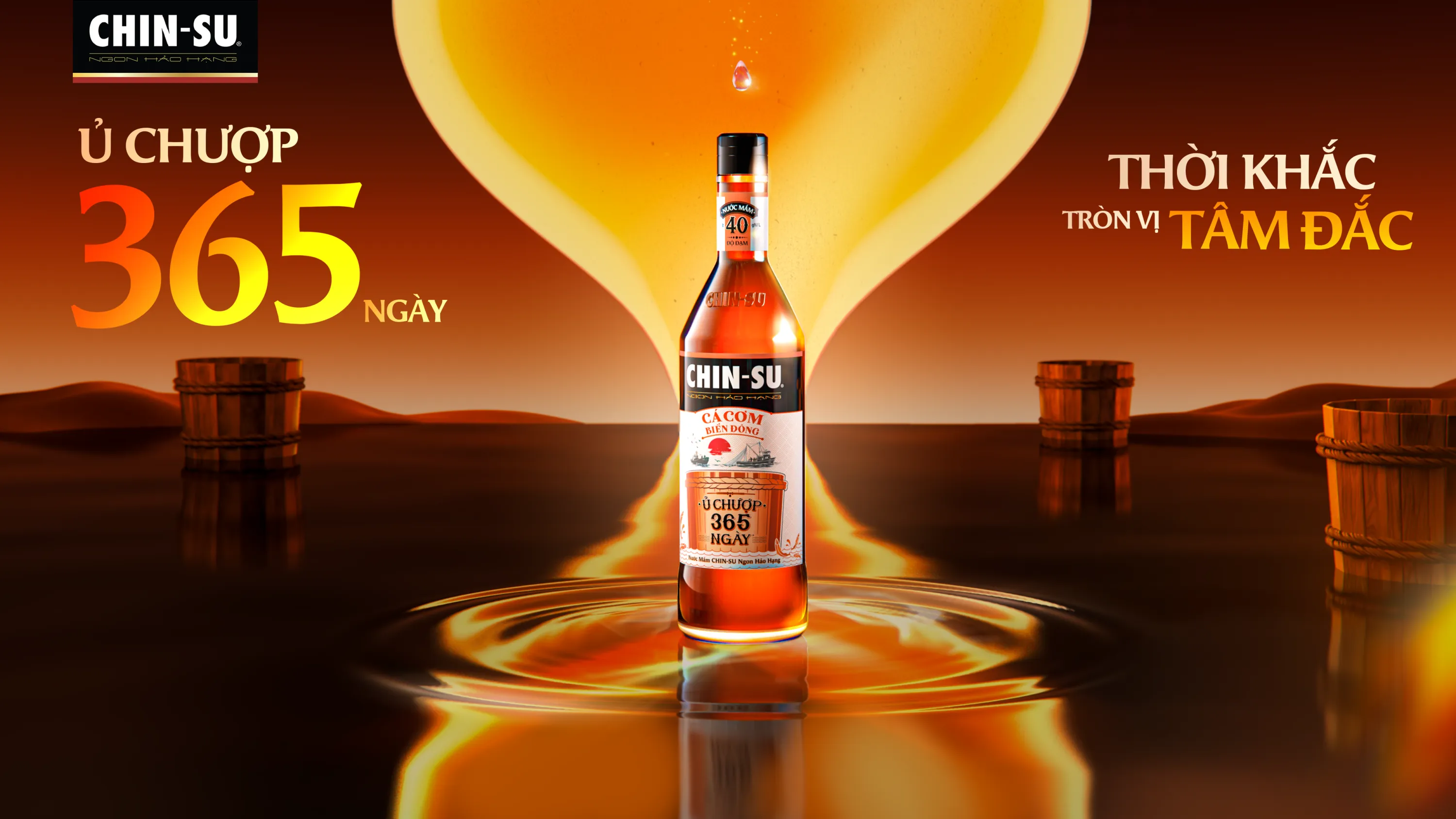
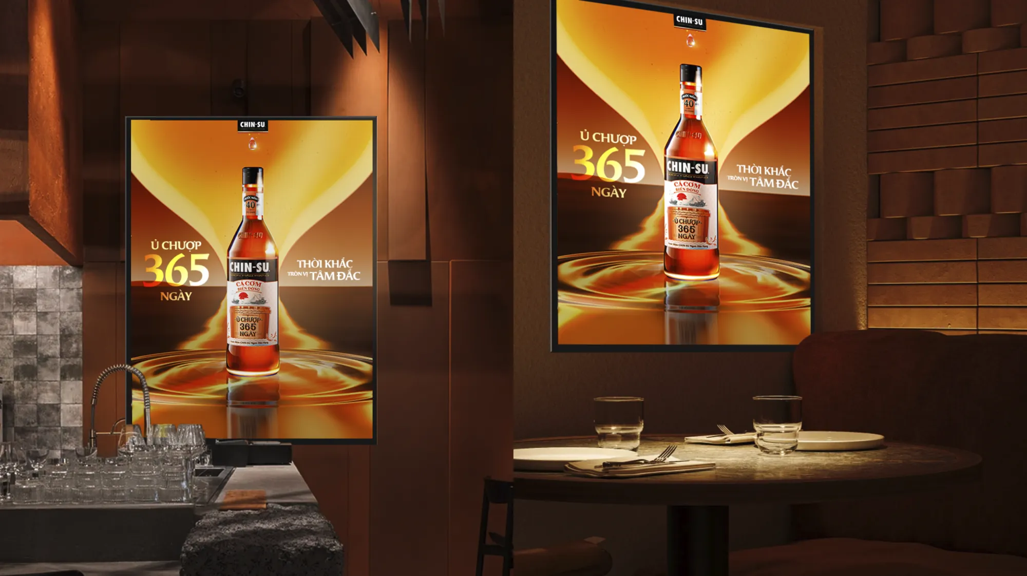
A premium, high-contrast visual aesthetic defined by rich amber tones and dramatic golden lighting to elevate the product's positioning. The layout highlights hyper-realistic liquid physics and a pristine bottle render at the center, using the hourglass outline purely as a structural framing element and a lighting device to signify the time narrative without any literal interpretation.

KEY VISUAL OPTION 2
ART DIRECTION
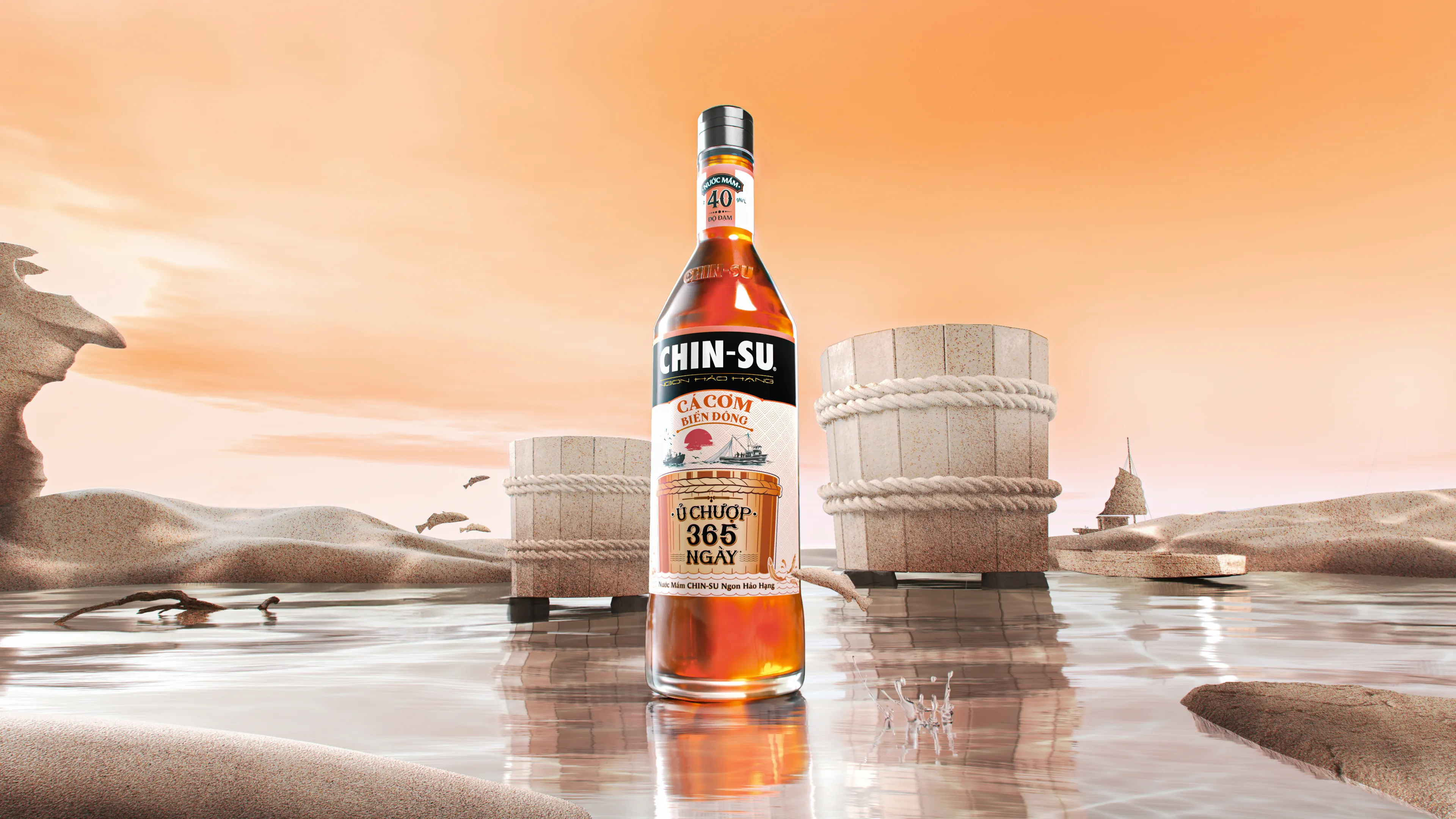
A cinematic, sun-drenched aesthetic dominated by warm gold, sand, and deep amber tones to elevate the product's high-end positioning. The background features traditional fermentation vats and maritime objects structurally stylized as weather-beaten sand dunes, serving as a tactile manifestation of time. This rugged, organic texture creates a sophisticated contrast against the pristine, hyper-realistic bottle render and sharp water reflections in the foreground, maximizing both brand prestige and appetite appeal.


ACB VISA FLEX CARD
client
VISA | ACB
SERVICES
KEY VISUAL 3D GRAPHIC DESIGN
CONCEPT
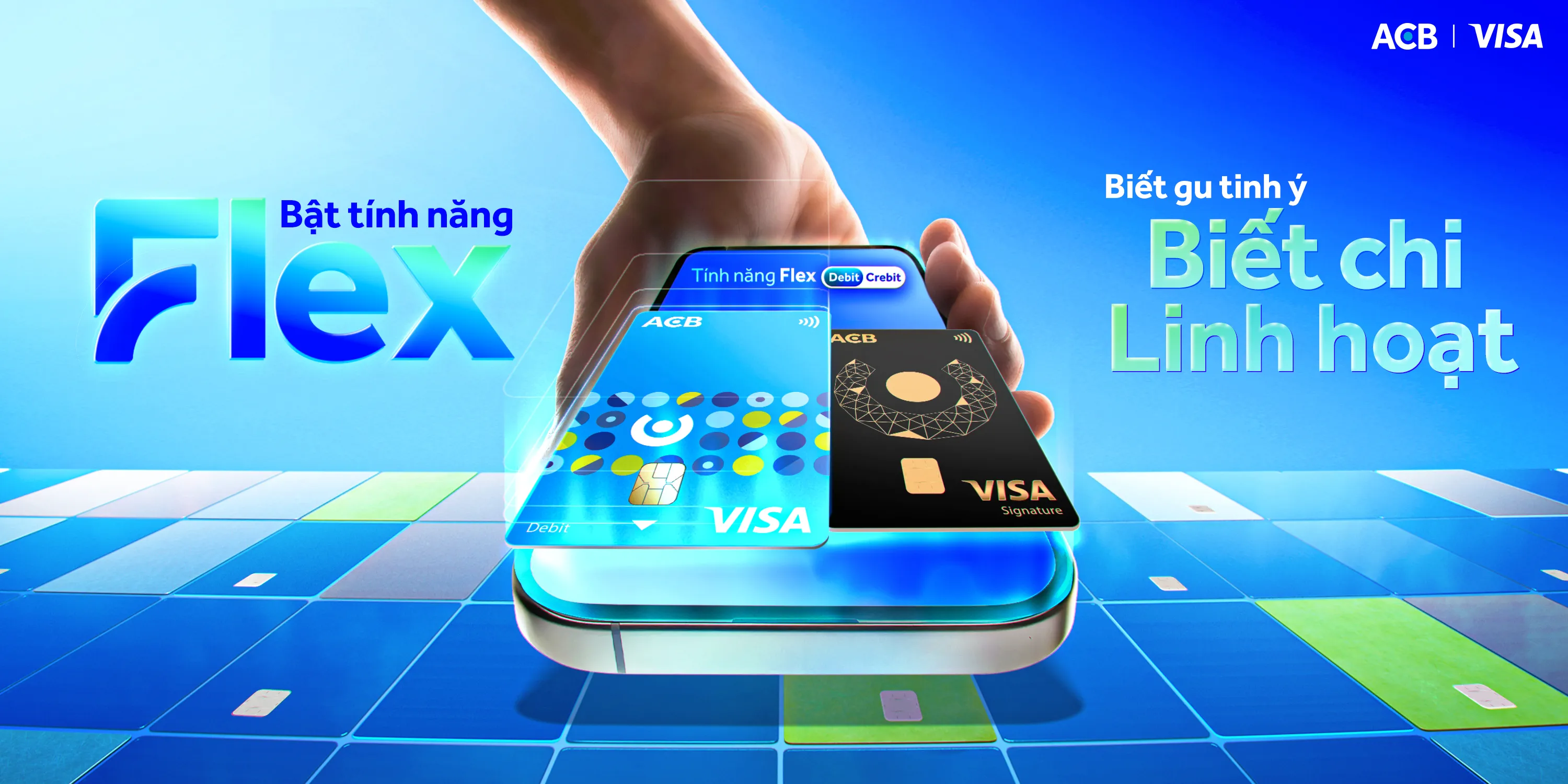
"BIẾT GU TINH Ý - BIẾT CHI LINH HOẠT" (Sharp Taste, Flexible Spending)
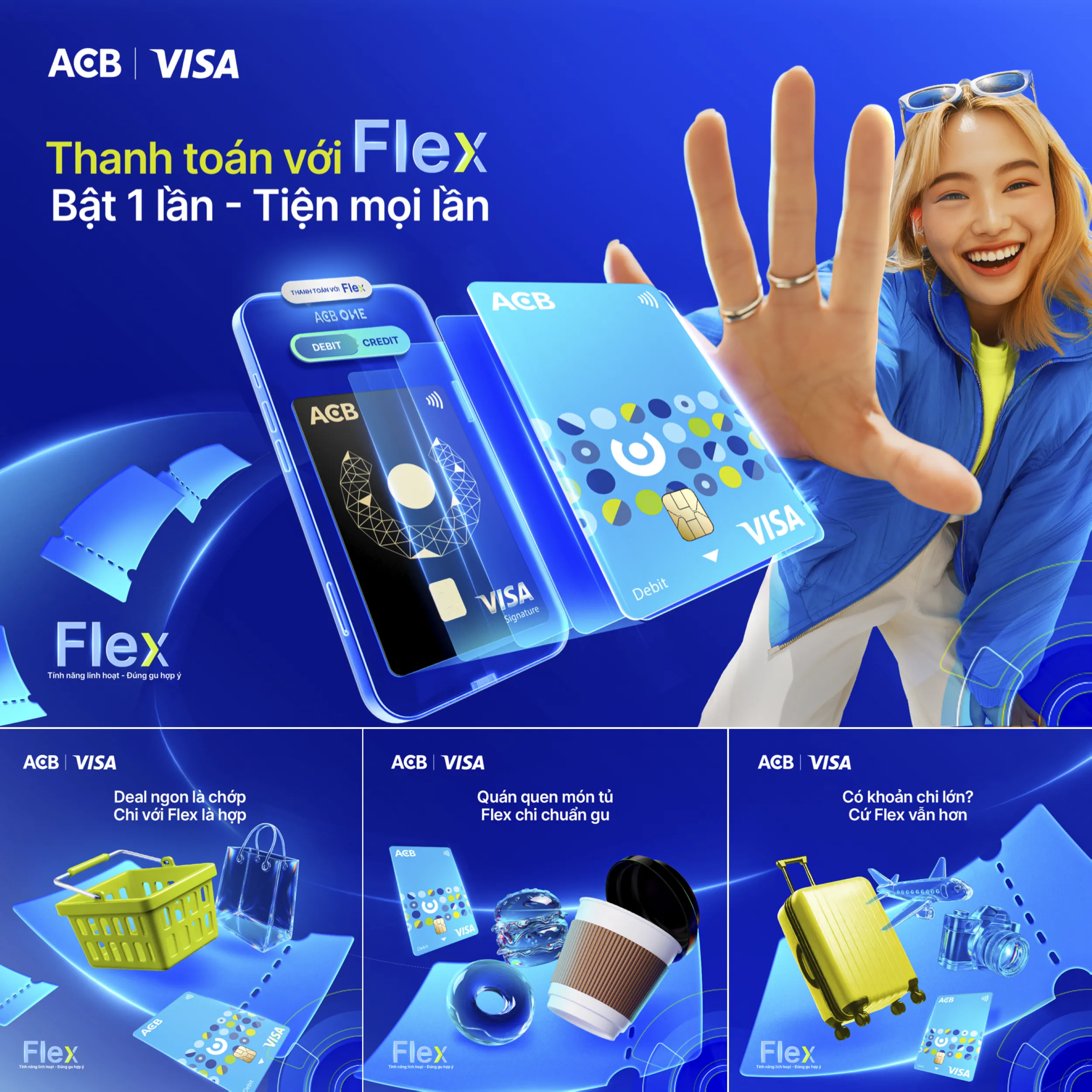
The launching campaign for ACB Visa Flex centers on its breakthrough feature that seamlessly integrates both Debit and Credit into a single card solution. The concept empowers modern, tech-savvy users with absolute financial freedom, allowing them to intelligently toggle their funding sources via the ACB ONE app. It celebrates a sophisticated lifestyle where consumers can effortlessly match their sharp personal taste with smart, dynamic, and flexible spending choices.

KEY VISUAL OPTION 2
ART DIRECTION
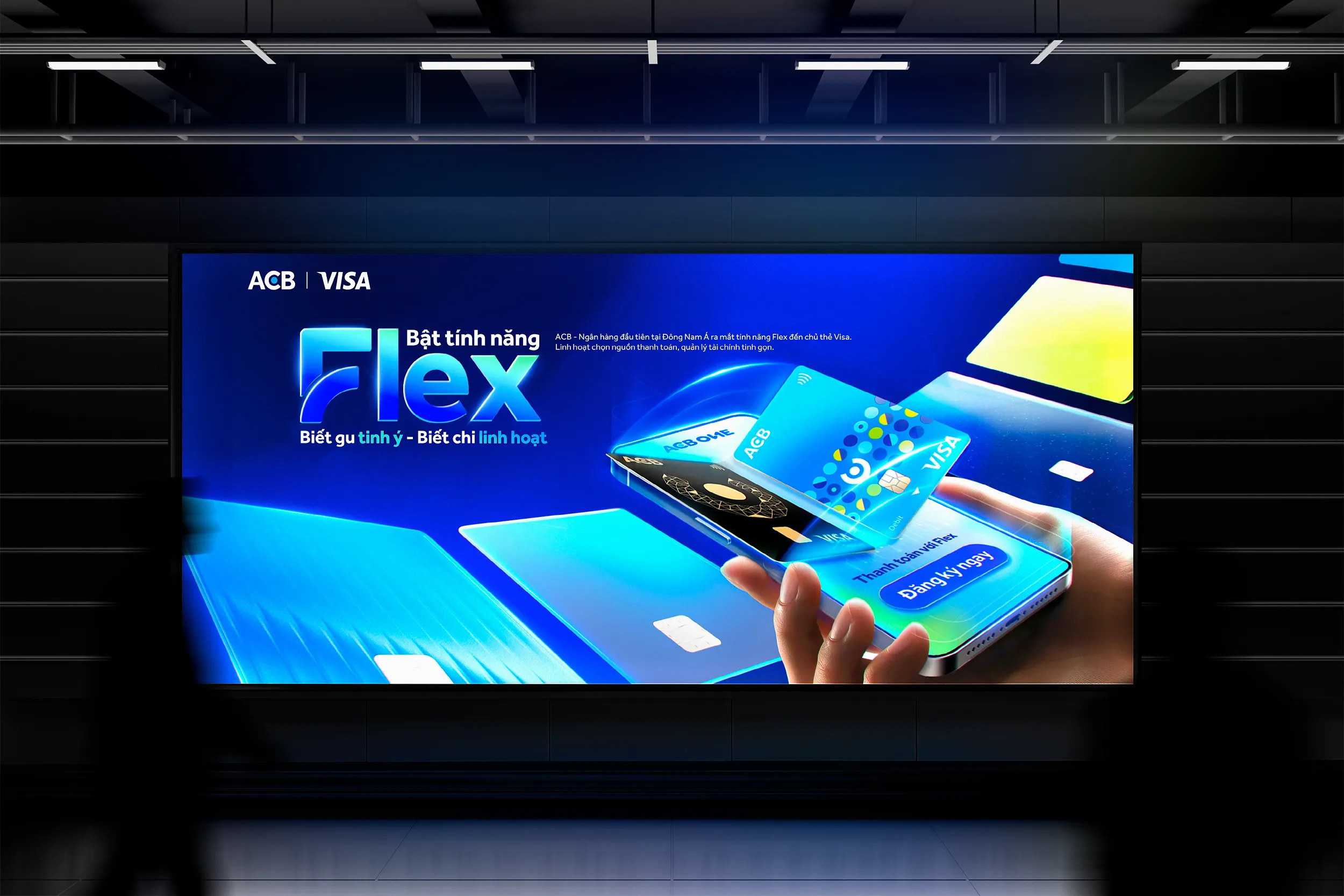
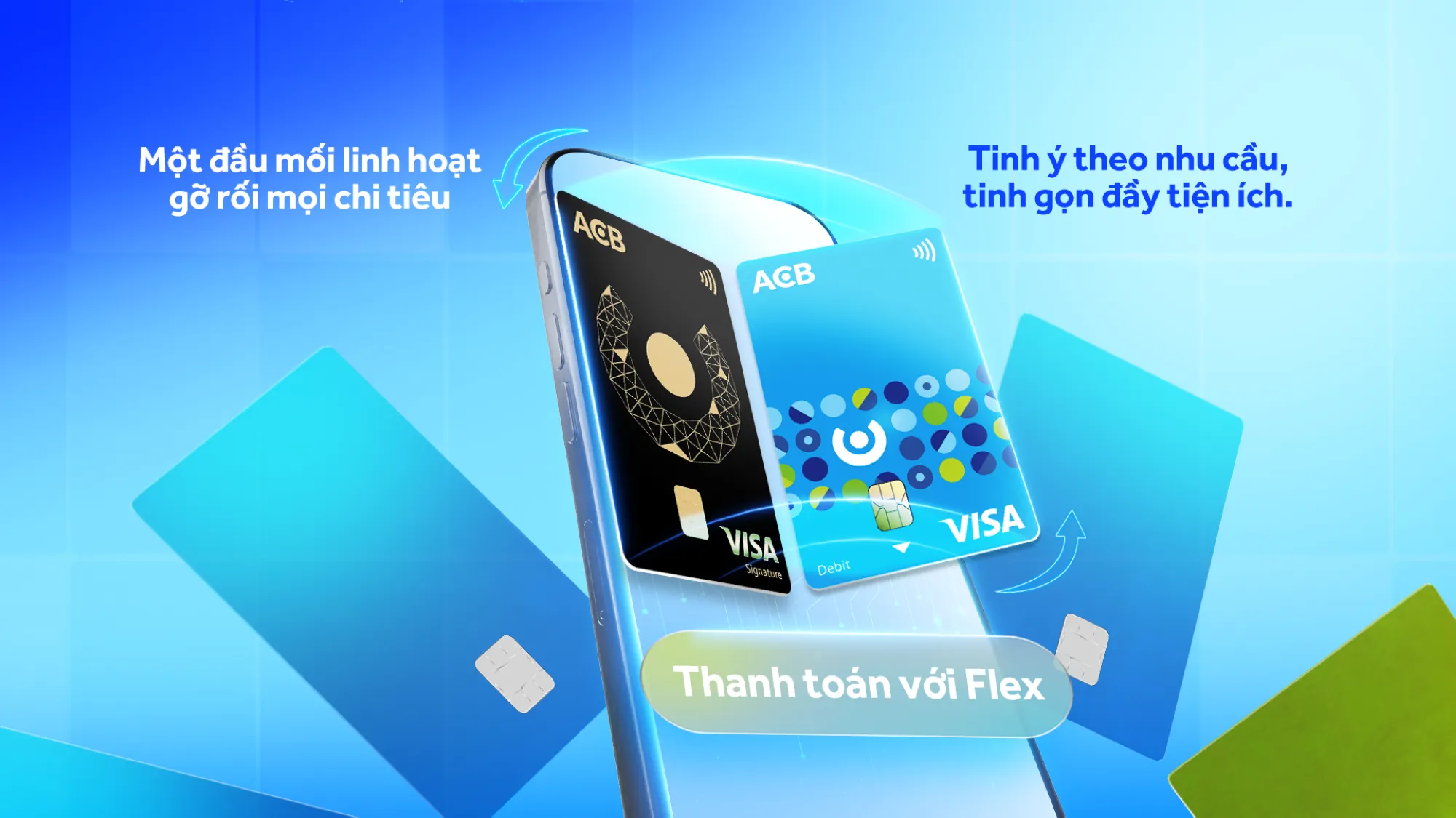
The Key Visual employs a sleek 3D digital composition, anchoring a hand-held smartphone as the focal point. Floating from the screen, two contrasting card designs visualize the dual nature of Debit and Credit merging into one, while the surrounding multi-colored card tiles metaphorically represent the ultimate integration of multiple separate cards and funding sources into a single solution. The scene utilizes a high-contrast palette of electric blue, neon cyan, and glowing green to deliver a premium tech aesthetic, cleanly framing the tagline: "Bật tính năng Flex - Biết gu tinh ý - Biết chi linh hoạt".
SOCIAL ADAPTATION
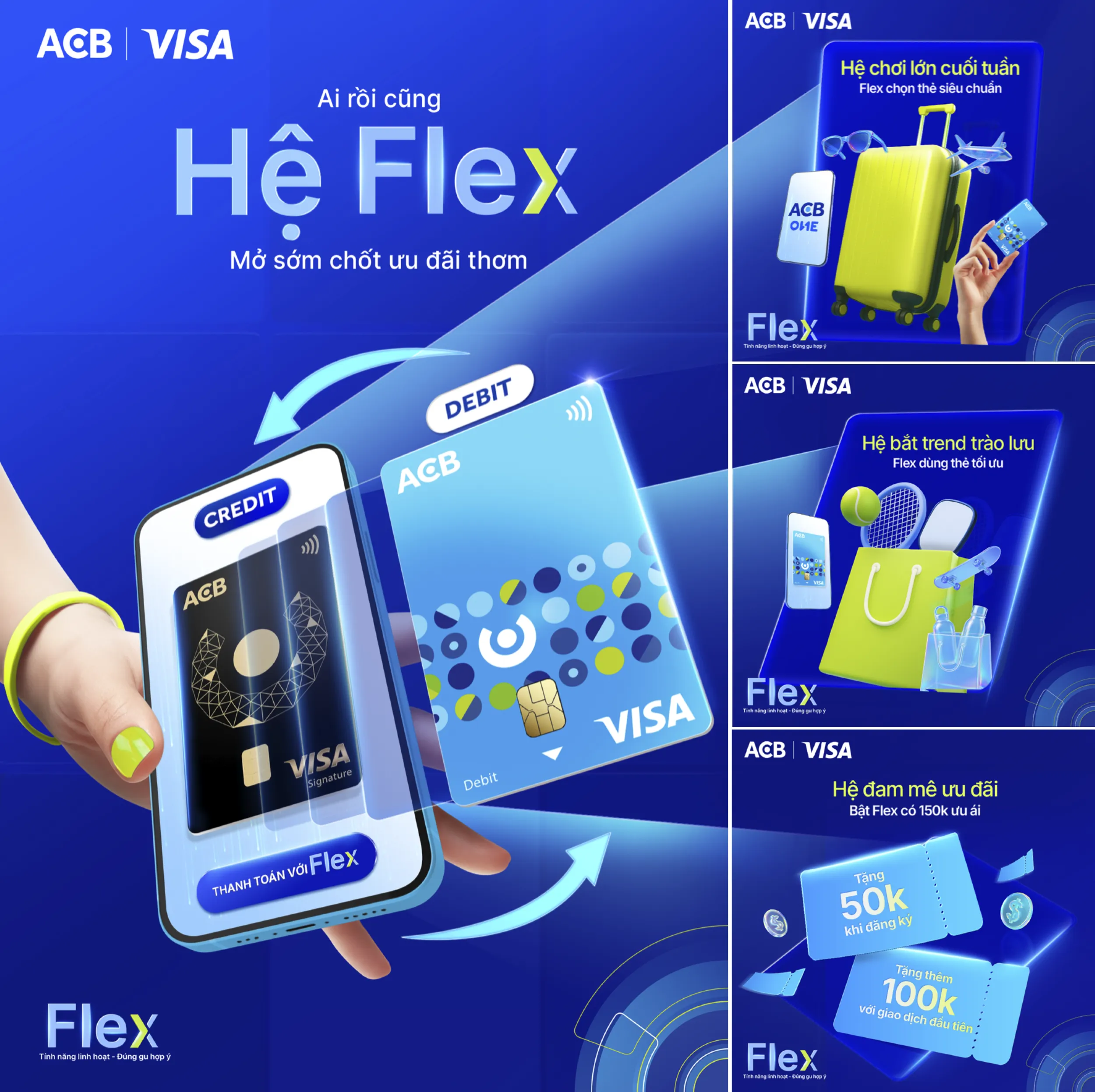
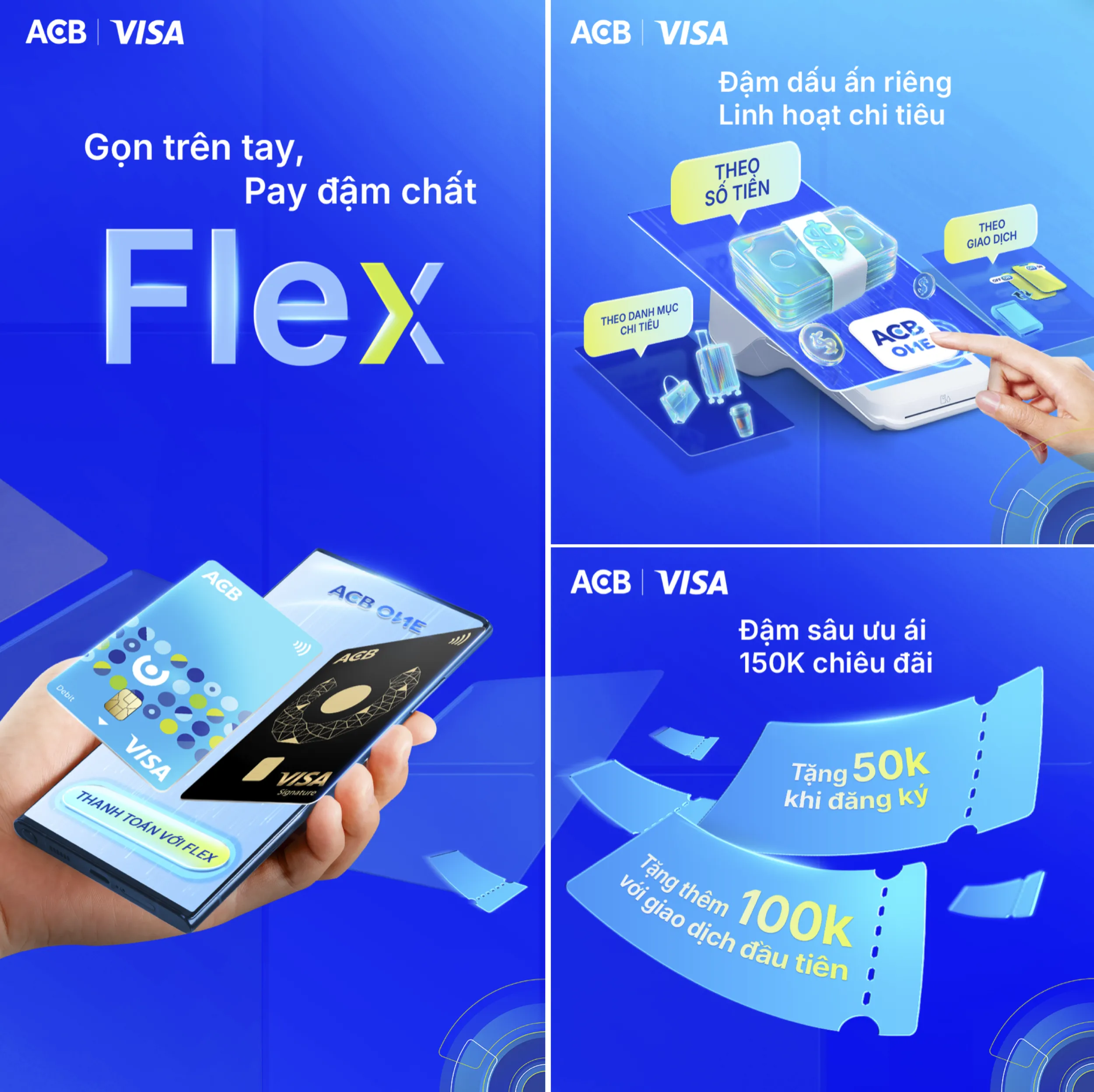
VIDEO TUTORIAL

KEY VISUAL OPTION 2
ART DIRECTION
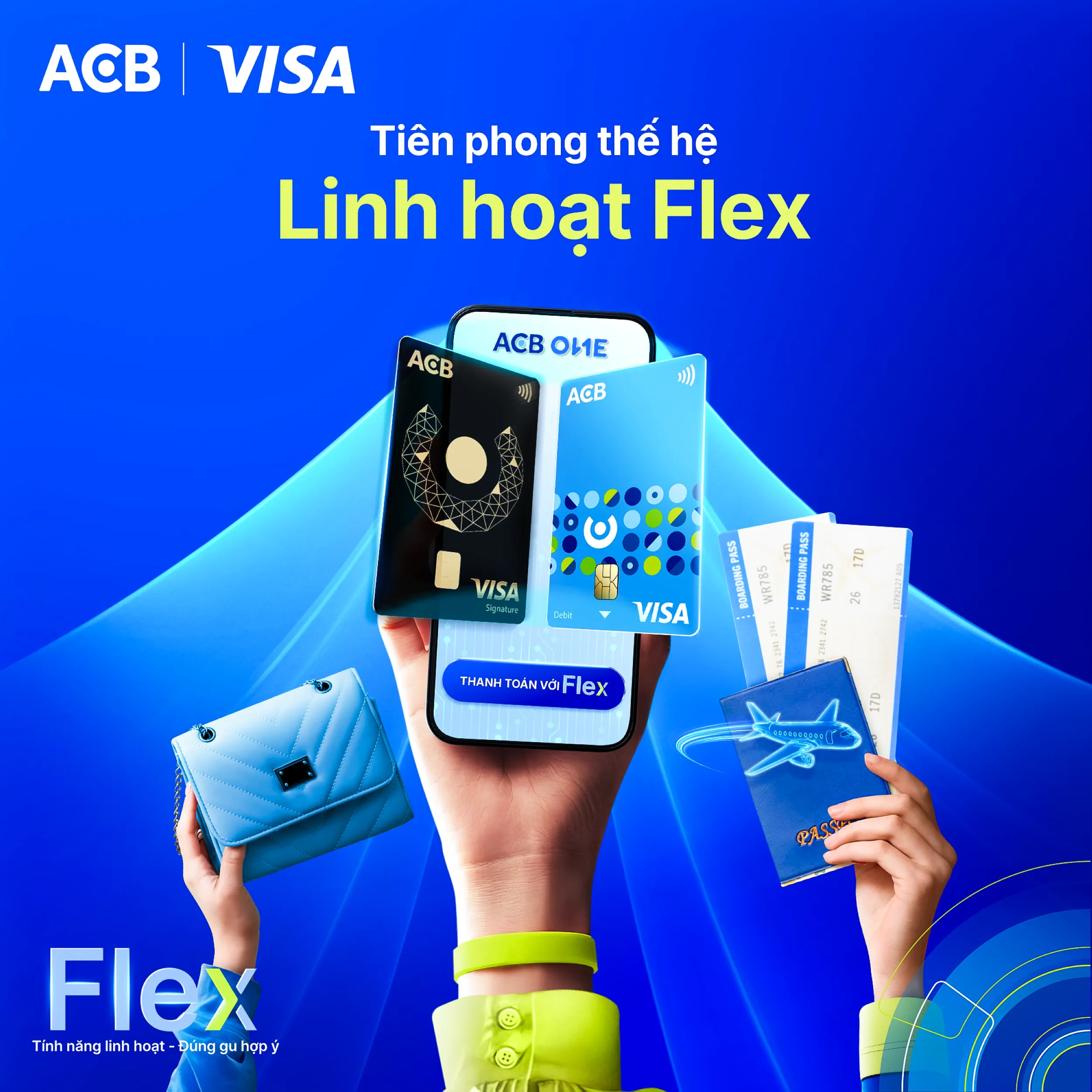
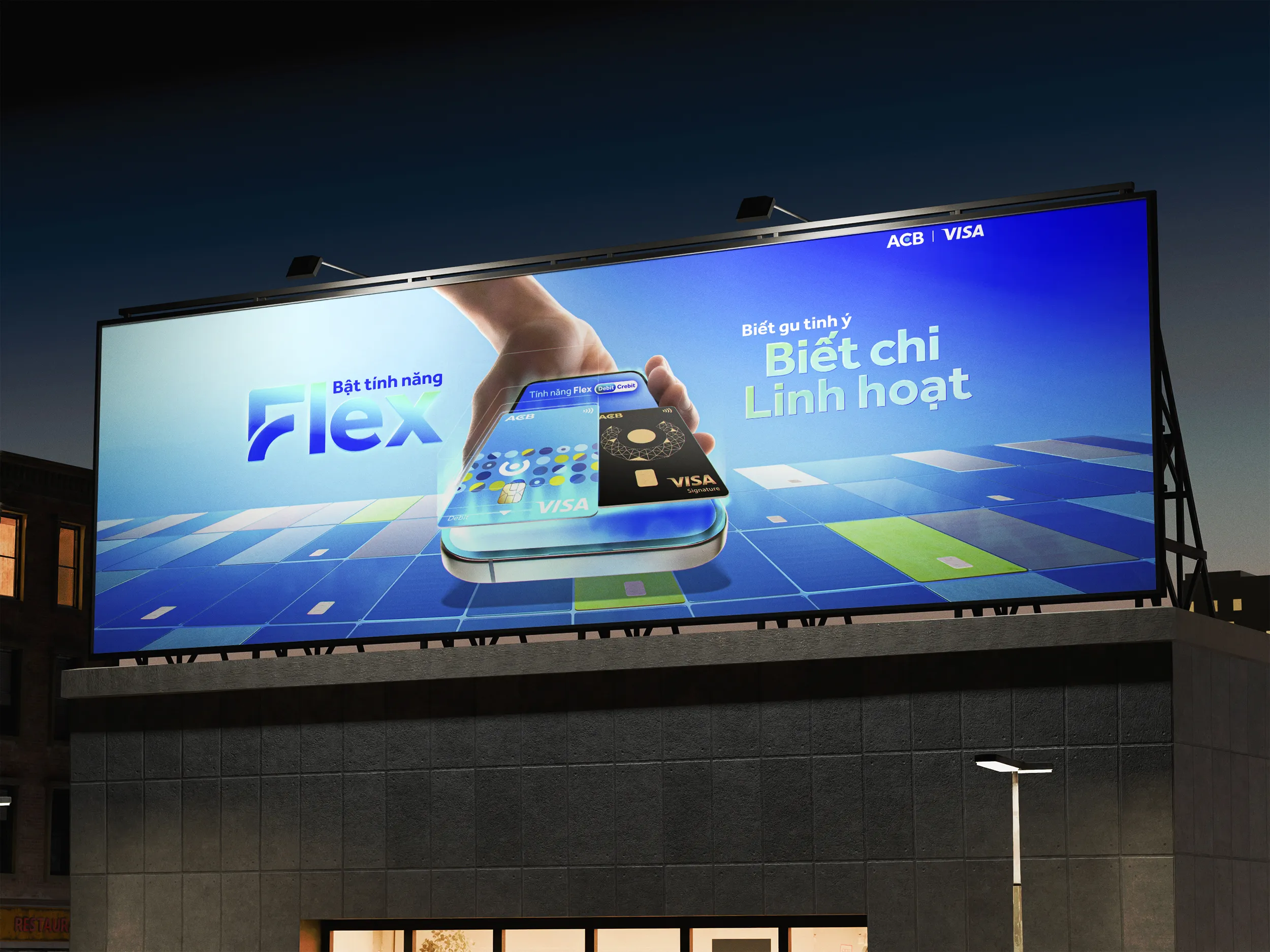
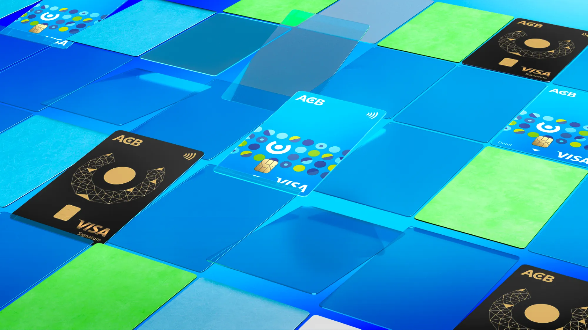
The Key Visual features a clean, centered 3D tech composition, anchoring a hand-held smartphone with a holographic glass container from which the dual Debit and Credit cards dynamically emerge. Crucially, the entire base is structured as an infinite perspective grid built from multi-colored digital card tiles (blue, teal, and neon green), metaphorically representing the ultimate consolidation of multiple separate cards and diverse funding sources into one single interface. The scene is illuminated by a high-contrast palette of electric blue and luminous green gradients with sharp edge-lighting, delivering a premium, hyper-realistic digital aesthetic.


AQUA COLOR AI
client
AQUA
SERVICES
KEY VISUAL 3D GRAPHIC DESIGN
CONCEPT
The launching campaign for AQUA's premium washing machine line centers on its breakthrough "Color AI" technology, highlighting the multi-colored touchscreen interface and smart AI optimization. The concept visualizes ultimate domestic freedom and effortless garment care, where advanced AI instantly calculates and optimizes washing parameters for every specific preset. It redefines a mundane household chore into a vibrant, stress-free lifestyle experience that perfectly adapts to every fabric and color palette.
KEY VISUAL OPTION 2
ART DIRECTION
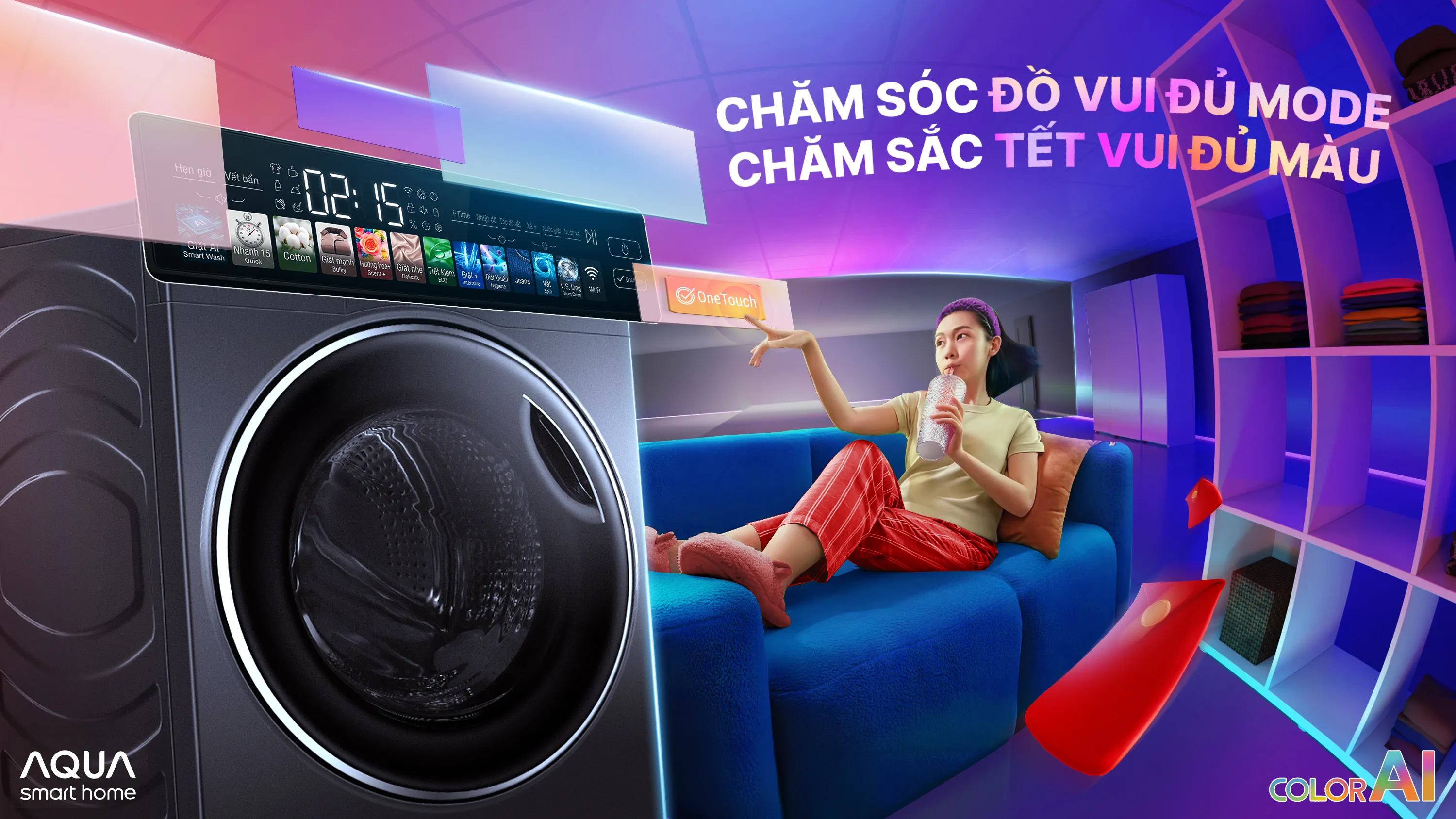
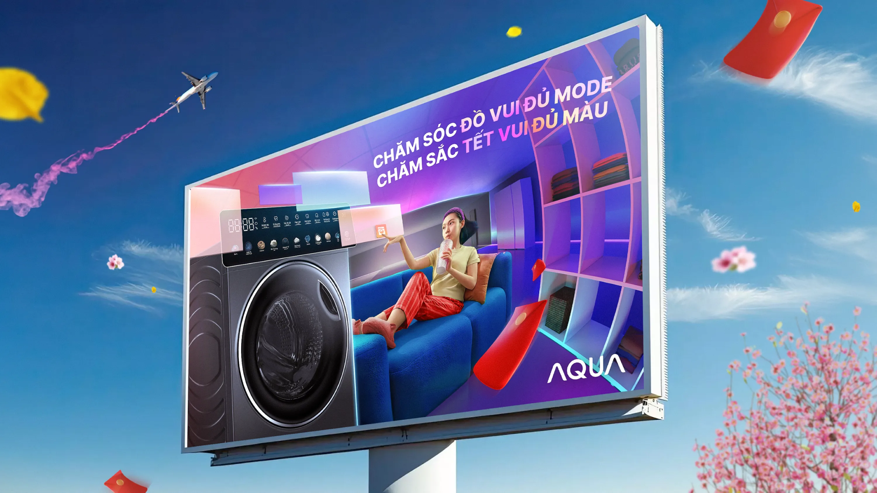
The Key Visual utilizes a dynamic fisheye lens to create an immersive, ultra-wide perspective designed to resonate with tech-forward young families. In the close-up foreground, a premium 3D render of the dark-metallic washing machine takes center stage, highlighted by floating translucent geometric plates that abstractly visualize the UI presets. Crucially, the entire background living space is saturated with vibrant, multi-colored ambient lighting to metaphorically mirror the machine's color touchscreen. This colorful environment frames a relaxed character lounging effortlessly, emphasizing absolute hands-free convenience where a single interaction with the holographic 'OneTouch' prompt triggers complete AI-driven automation.
WAKE-UP 247
client
WAKE-UP 247
SERVICES
KEY VISUAL 3D GRAPHIC DESIGN
CONCEPT
"DŨNG MÃNH VƯỢT LÊN GIỚI HẠN" (Roaring Bravery - Beyond All Limits)
The creative concept seamlessly fuses Wake-up 247’s raw, non-stop energy with Manchester City’s fierce, unstoppable football spirit.
The campaign positions the beverage as the ultimate catalyst that awakens the untamed bravery within players and consumers alike, empowering them to shatter every physical and mental boundary.
KEY VISUAL OPTION 1
The Key Visual utilizes a highly dynamic composition, anchoring the iconic Wake-up 247 bottle at the center, flanked by Man City stars in explosive, high-intensity action poses to create immersive 3D depth. The color palette features a striking contrast between Man City’s signature Sky Blue and Wake-up 247’s fiery orange-gold. Sharp, aggressive light-streaks slice through the scene, paired with realistic water splashes and motion blur against a dramatic stadium or urban backdrop. The typography features a bold, heavy, tilted sans-serif font to aggressively drive home the main tagline: "DŨNG MÃNH VƯỢT LÊN GIỚI HẠN" (Roaring Bravery - Beyond All Limits).
KEY VISUAL OPTION 2
Driven by the tagline "CHUNG DŨNG MÃNH - TUNG MÃNH LỰC" (United Bravery - Unleashing Pure Power), the concept fuses Manchester City’s collective power with Wake-up 247’s explosive energy. The Art Direction utilizes a dynamic, asymmetric layout, featuring a colossal hand gripping the bottle in the left foreground while the squad bursts into a high-velocity horizontal sprint. A solid, fiery orange backdrop forces the signature Sky Blue kits to pop aggressively. Sharp horizontal neon light-trails amplify the supersonic speed, while bold white sans-serif typography cleanly anchors the main tagline in the upper-right space.
CHINSU 365
client
CHINSU
SERVICES
KEY VISUAL 3D GRAPHIC DESIGN
CONCEPT
A launching campaign for Chin-su’s premium line that highlights its ultimate USP: a continuous 365-day traditional aging process. The hourglass is strategically deployed as the core visual metaphor, masterfully turning the slow, uninterrupted passage of time into a continuous flow of rich flavor, symbolizing pure dedication and premium quality.
KEY VISUAL OPTION 1
A premium, high-contrast visual aesthetic defined by rich amber tones and dramatic golden lighting to elevate the product's positioning. The layout highlights hyper-realistic liquid physics and a pristine bottle render at the center, using the hourglass outline purely as a structural framing element and a lighting device to signify the time narrative without any literal interpretation.
KEY VISUAL OPTION 2
A cinematic, sun-drenched aesthetic dominated by warm gold, sand, and deep amber tones to elevate the product's high-end positioning. The background features traditional fermentation vats and maritime objects structurally stylized as weather-beaten sand dunes, serving as a tactile manifestation of time. This rugged, organic texture creates a sophisticated contrast against the pristine, hyper-realistic bottle render and sharp water reflections in the foreground, maximizing both brand prestige and appetite appeal.
ACB VISA FLEX CARD
client
VISA | ACB
SERVICES
KEY VISUAL 3D GRAPHIC DESIGN
CONCEPT
"BIẾT GU TINH Ý - BIẾT CHI LINH HOẠT" (Sharp Taste, Flexible Spending)
The launching campaign for ACB Visa Flex centers on its breakthrough feature that seamlessly integrates both Debit and Credit into a single card solution. The concept empowers modern, tech-savvy users with absolute financial freedom, allowing them to intelligently toggle their funding sources via the ACB ONE app. It celebrates a sophisticated lifestyle where consumers can effortlessly match their sharp personal taste with smart, dynamic, and flexible spending choices.
KEY VISUAL OPTION 2
The Key Visual employs a sleek 3D digital composition, anchoring a hand-held smartphone as the focal point. Floating from the screen, two contrasting card designs visualize the dual nature of Debit and Credit merging into one, while the surrounding multi-colored card tiles metaphorically represent the ultimate integration of multiple separate cards and funding sources into a single solution. The scene utilizes a high-contrast palette of electric blue, neon cyan, and glowing green to deliver a premium tech aesthetic, cleanly framing the tagline: "Bật tính năng Flex - Biết gu tinh ý - Biết chi linh hoạt".
SOCIAL ADAPTATION
VIDEO TUTORIAL
KEY VISUAL OPTION 2
The Key Visual features a clean, centered 3D tech composition, anchoring a hand-held smartphone with a holographic glass container from which the dual Debit and Credit cards dynamically emerge. Crucially, the entire base is structured as an infinite perspective grid built from multi-colored digital card tiles (blue, teal, and neon green), metaphorically representing the ultimate consolidation of multiple separate cards and diverse funding sources into one single interface. The scene is illuminated by a high-contrast palette of electric blue and luminous green gradients with sharp edge-lighting, delivering a premium, hyper-realistic digital aesthetic.
AQUA COLOR AI
client
AQUA
SERVICES
KEY VISUAL 3D GRAPHIC DESIGN
CONCEPT
The launching campaign for AQUA's premium washing machine line centers on its breakthrough "Color AI" technology, highlighting the multi-colored touchscreen interface and smart AI optimization. The concept visualizes ultimate domestic freedom and effortless garment care, where advanced AI instantly calculates and optimizes washing parameters for every specific preset. It redefines a mundane household chore into a vibrant, stress-free lifestyle experience that perfectly adapts to every fabric and color palette.
KEY VISUAL OPTION 2
The Key Visual utilizes a dynamic fisheye lens to create an immersive, ultra-wide perspective designed to resonate with tech-forward young families. In the close-up foreground, a premium 3D render of the dark-metallic washing machine takes center stage, highlighted by floating translucent geometric plates that abstractly visualize the UI presets. Crucially, the entire background living space is saturated with vibrant, multi-colored ambient lighting to metaphorically mirror the machine's color touchscreen. This colorful environment frames a relaxed character lounging effortlessly, emphasizing absolute hands-free convenience where a single interaction with the holographic 'OneTouch' prompt triggers complete AI-driven automation.
WAKE-UP 247
client
WAKE-UP 247
SERVICES
KEY VISUAL 3D GRAPHIC DESIGN
CONCEPT
"DŨNG MÃNH VƯỢT LÊN GIỚI HẠN" (Roaring Bravery - Beyond All Limits)
The creative concept seamlessly fuses Wake-up 247’s raw, non-stop energy with Manchester City’s fierce, unstoppable football spirit.
The campaign positions the beverage as the ultimate catalyst that awakens the untamed bravery within players and consumers alike, empowering them to shatter every physical and mental boundary.
KEY VISUAL OPTION 1
ART DIRECTION
The Key Visual utilizes a highly dynamic composition, anchoring the iconic Wake-up 247 bottle at the center, flanked by Man City stars in explosive, high-intensity action poses to create immersive 3D depth. The color palette features a striking contrast between Man City’s signature Sky Blue and Wake-up 247’s fiery orange-gold. Sharp, aggressive light-streaks slice through the scene, paired with realistic water splashes and motion blur against a dramatic stadium or urban backdrop. The typography features a bold, heavy, tilted sans-serif font to aggressively drive home the main tagline: "DŨNG MÃNH VƯỢT LÊN GIỚI HẠN" (Roaring Bravery - Beyond All Limits).
(04)
(05)
(03)
(02)
(01)
KEY VISUAL OPTION 2
ART DIRECTION
Driven by the tagline "CHUNG DŨNG MÃNH - TUNG MÃNH LỰC" (United Bravery - Unleashing Pure Power), the concept fuses Manchester City’s collective power with Wake-up 247’s explosive energy. The Art Direction utilizes a dynamic, asymmetric layout, featuring a colossal hand gripping the bottle in the left foreground while the squad bursts into a high-velocity horizontal sprint. A solid, fiery orange backdrop forces the signature Sky Blue kits to pop aggressively. Sharp horizontal neon light-trails amplify the supersonic speed, while bold white sans-serif typography cleanly anchors the main tagline in the upper-right space.
CHINSU 365
client
CHINSU
SERVICES
KEY VISUAL 3D GRAPHIC DESIGN
CONCEPT
A launching campaign for Chin-su’s premium line that highlights its ultimate USP: a continuous 365-day traditional aging process. The hourglass is strategically deployed as the core visual metaphor, masterfully turning the slow, uninterrupted passage of time into a continuous flow of rich flavor, symbolizing pure dedication and premium quality.
KEY VISUAL OPTION 1
ART DIRECTION
A premium, high-contrast visual aesthetic defined by rich amber tones and dramatic golden lighting to elevate the product's positioning. The layout highlights hyper-realistic liquid physics and a pristine bottle render at the center, using the hourglass outline purely as a structural framing element and a lighting device to signify the time narrative without any literal interpretation.
KEY VISUAL OPTION 2
ART DIRECTION
A cinematic, sun-drenched aesthetic dominated by warm gold, sand, and deep amber tones to elevate the product's high-end positioning. The background features traditional fermentation vats and maritime objects structurally stylized as weather-beaten sand dunes, serving as a tactile manifestation of time. This rugged, organic texture creates a sophisticated contrast against the pristine, hyper-realistic bottle render and sharp water reflections in the foreground, maximizing both brand prestige and appetite appeal.
ACB VISA FLEX CARD
client
VISA | ACB
SERVICES
KEY VISUAL 3D GRAPHIC DESIGN
CONCEPT
"BIẾT GU TINH Ý - BIẾT CHI LINH HOẠT" (Sharp Taste, Flexible Spending)
The launching campaign for ACB Visa Flex centers on its breakthrough feature that seamlessly integrates both Debit and Credit into a single card solution. The concept empowers modern, tech-savvy users with absolute financial freedom, allowing them to intelligently toggle their funding sources via the ACB ONE app. It celebrates a sophisticated lifestyle where consumers can effortlessly match their sharp personal taste with smart, dynamic, and flexible spending choices.
KEY VISUAL OPTION 2
ART DIRECTION
The Key Visual employs a sleek 3D digital composition, anchoring a hand-held smartphone as the focal point. Floating from the screen, two contrasting card designs visualize the dual nature of Debit and Credit merging into one, while the surrounding multi-colored card tiles metaphorically represent the ultimate integration of multiple separate cards and funding sources into a single solution. The scene utilizes a high-contrast palette of electric blue, neon cyan, and glowing green to deliver a premium tech aesthetic, cleanly framing the tagline: "Bật tính năng Flex - Biết gu tinh ý - Biết chi linh hoạt".
SOCIAL ADAPTATION
VIDEO TUTORIAL
KEY VISUAL OPTION 2
ART DIRECTION
The Key Visual features a clean, centered 3D tech composition, anchoring a hand-held smartphone with a holographic glass container from which the dual Debit and Credit cards dynamically emerge. Crucially, the entire base is structured as an infinite perspective grid built from multi-colored digital card tiles (blue, teal, and neon green), metaphorically representing the ultimate consolidation of multiple separate cards and diverse funding sources into one single interface. The scene is illuminated by a high-contrast palette of electric blue and luminous green gradients with sharp edge-lighting, delivering a premium, hyper-realistic digital aesthetic.
AQUA COLOR AI
client
AQUA
SERVICES
KEY VISUAL 3D GRAPHIC DESIGN
CONCEPT
The launching campaign for AQUA's premium washing machine line centers on its breakthrough "Color AI" technology, highlighting the multi-colored touchscreen interface and smart AI optimization. The concept visualizes ultimate domestic freedom and effortless garment care, where advanced AI instantly calculates and optimizes washing parameters for every specific preset. It redefines a mundane household chore into a vibrant, stress-free lifestyle experience that perfectly adapts to every fabric and color palette.
KEY VISUAL OPTION 2
ART DIRECTION
The Key Visual utilizes a dynamic fisheye lens to create an immersive, ultra-wide perspective designed to resonate with tech-forward young families. In the close-up foreground, a premium 3D render of the dark-metallic washing machine takes center stage, highlighted by floating translucent geometric plates that abstractly visualize the UI presets. Crucially, the entire background living space is saturated with vibrant, multi-colored ambient lighting to metaphorically mirror the machine's color touchscreen. This colorful environment frames a relaxed character lounging effortlessly, emphasizing absolute hands-free convenience where a single interaction with the holographic 'OneTouch' prompt triggers complete AI-driven automation.

